Interview with Matt Godden, The Metaning
Interview with Matt Godden, creator of The Metaning
By Ben Kooyman
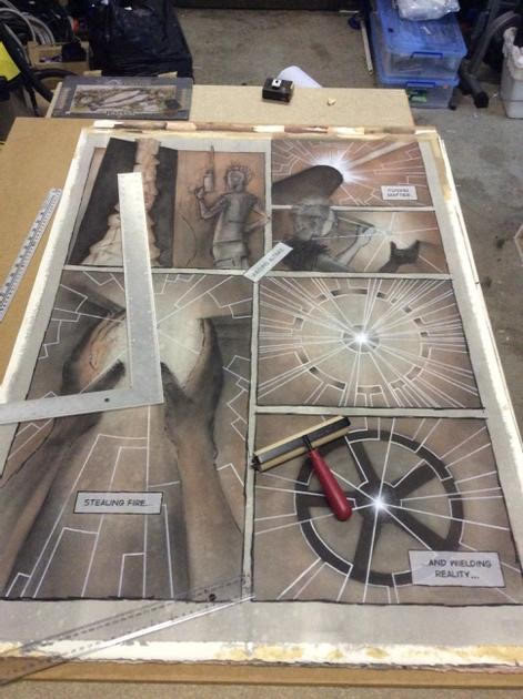
The Metaning is an exhibition currently running in Sydney at the Carlton Project Space in Chippendale until 25 July. It’s a 22-page comic book work comprised of 22 large 113x82cm paintings presented in a gallery space. Creator Matt Godden invited the Australian Comics Journal along to opening night and kindly answered some questions shortly after…
You’ve done comics in traditional print form in the past, and I’m curious how your approach changes on a project like this. Is it a radically different undertaking, or are your thought processes and artistic practices similar?
From an initial writing perspective within my practice it’s fairly similar – it’s still thumbnailed at around 5x3cm, then sketched at around A4. From there, things are different. With this project I was trying to stay as analog as possible with the construction of each work – with the exception of two pages, all the enlargements from the sketch are basic gridding techniques. There’s also no removal of the rough linework, which is various shades of blue and red, and still visible within the work if you look hard enough.
While my previous books are very produced and technical, making this work, especially given its scale, was a far more physical experience. At that size, you have to involve your whole body, not just from the scale of mark-making, but on a practical level – you have to step back a few paces to see the whole page. That dance, the physicality of making the work at a scale that’s comparable to yourself is something you get when you’re working in human-scale sculpture as well, and there’s a certain satisfaction that comes from being body-tired after a session of making.
In publicity materials you mention that this is, to the best of your knowledge, the first presentation of a complete comic book story within a gallery space in Australia. What do you think are some of the implications of this? Does telling a story across a space like this, using a larger canvas, open up new storytelling possibilities?
Reflecting from the opening of the exhibition, I think a major implication is a breakdown of the tyranny of pagination, for want of a better phrase. It’s something I hadn’t really thought about until I saw it up on the walls – and to clarify, hanging the exhibition was the first time I saw the complete work hanging at once. When you get the book out of a binding and at this sort of scale, you can very easily go from focussing on a spread in front of you, then back out to a wider view. There’s definitely an impact in being able to see the whole work at once. The other thing, is that this book can only be experienced in its native form for a short period of time – three weeks in this case. We’re used to comics being something we can pick up and read, and re-read over and over, and while there’s an iBooks version to do that, it really isn’t the same. Perhaps it’s an experience more akin to that of music – you can listen to the album over and over, but the live performance is ephemeral.
As for whether it opens new storytelling possibilities, that’s a good question. It would be an interesting challenge to see if you could create a work in which, depending on the order in which they were read, the same set of pages would form different stories. Then, try setting that up in a space where the shape of the environment would let you literally take different paths through the work to experience those permutations. Or, perhaps arranging a work in a clover-leaf-plan exhibition space, where the pages at the crossroads depict a specific event, then each loop off of that shows a different person’s perspective of the event.
Walking is an activity that engages more of your brain that just about anything else, and so I imagine there should be something different happening when reading a book while moving around a gallery, versus sitting down, looking at a page or screen.
Did you find yourself thinking about the relationship between the reader-spectator and the work differently to any of your previous comic book works? How do you think a reader-spectator’s approach to digesting and interpreting the work changes in a gallery space?
I’ve always had a love, first and foremost in comics, with panel layouts. The composition of the page, as a set of rectangles, ignoring the imagery within, is to me the highpoint of the exercise. That inclination towards a sort of De Stijl abstraction means that when you get up to wall-scale, you really start to play in that territory the New York abstract expressionists were into – if you think about the experience of standing before a Rothko painting, it would be nice to think that looking at a comic book page, whose physical presence can dominate your field of view at an engaged-body distance, might produce a similar experience. That’s certainly a level of visceral connection I don’t think I’ve aimed for previously.
I think for most people, merely being in a gallery changes the way they think about things. There’s an implied authority to things put on a gallery wall – an entire class of building whose purpose is to isolate artistic curiosities from the visual background noise of the world at large. Living as we do, especially in Sydney, in a culture in which space is rapidly becoming an unaffordable commodity, there’s a certain transgressiveness to large physical artworks, sculpture being the best example – an object which greedily consumes space for no practical reason is an increasingly outrageous prospect.
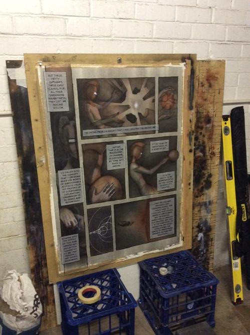 The story chronicles an artist’s struggles to switch from sculpture to fine art drawing, and his eventual embrace of the comics medium. Obviously there are material & practical differences between these three mediums, but I get a sense from your story that you feel there’s something concrete and precise about sculpture and comics that you couldn’t find in fine drawing. Would that be accurate or am I barking up the wrong tree?
You could say that. I trained at art school as a sculptor, under people who were very much a part of the Formalist tradition within Modernism. For them, all that mattered was the work as it existed. We were never really asked what the work was “about”, or what it “meant”. What was important was the aesthetic qualities of the object – proportion, the tension between mass and gravity, everything that the work is, and which can be deduced without an artist’s statement.
Comics and formalist sculpture are both quite strong on the craft of making. The Drawing department had an attitude, for final-year students, you could perhaps say was more from the conceptual end of the spectrum. Having spent a year in a welding bay making aesthetically beautiful objects, to be wrapping my degree up in Drawing, being told that the pursuit of beautiful objects was, effectively, not enough, well I have a distrust, until convinced otherwise, of the quality of ideas from those who can say, but not do, and “concept” has always been rather strongly tied to saying, as opposed to doing.
So this work was created in response to your own student experiences: was that process therapeutic?
To an extent. While the work documents my experience as each progress critique found me in conflict with the head of drawing, by the time the year was concluding, it was obvious to me that what was coming out of the process was so much better than what I’d planned at the beginning of the year, that really there wasn’t a way to have any ill-will from the experience.
All the great truths are built on lies, and the best lies contain a kernel of truth. That’s the thing with this work – it’s both a shout of outrage, and self-mockery at the idea that someone could get so worked up over something which in the grand scheme of things is pretty minor.
There’s something of a manifesto air to this work. Do you see it as a manifesto of sorts, and if so how closely intertwined are the manifesto and the work’s presentation as a gallery exhibition? Do you think that message may be interpreted differently by, say, a person reading the story in a gallery space and someone else reading the collected PDF online?
The parts of the work where I’m talking about the fact that comics are under-rated in academia are definitely a manifesto of sorts, [but] of course it’s also the self-mocking Ted Kaczynski shack-in-the-woods image of manifesto writing I’m thinking of. When it comes to the intersection of Fine Art and comics, something that’s always bugged me is the tendency to only credit comics artists when they do things that are not actual comic book pages – when they do stand-alone images, or draw on objects etc. I’m all for extending oneself to other mediums, I think it’s a vital exercise for any artist, but when it comes to comics artists, it seems that they’re only accepted as doing something that’s “proper” art when they forsake their own medium, and work within Fine Art’s existing familiarity.
What I’m hoping to achieve with this project is to co-opt Fine Art’s gallery setting and human-body scale, to serve the comics medium, rather than as is typically the case, of comics’ graphical idioms and visual language being appropriated to serve Fine Art.
As for the difference between the online and in-person reading experience, I think the central premise that comics have a rightful claim to a presence in the canon of drawing education, by virtue of being the most widely consumed and practiced form of drawing, is magnified by the fact that you’re actually interacting with it in the same context as you would for any other Fine Art. The digital version could realistically be at almost any scale. The abstract knowledge that what you’re looking at is a photo of a thing, which you’re told is a certain size, doesn’t really substitute for experiencing something at its actual scale, where you can move yourself nearer or further and learn that size relationship on a visceral level.
You mentioned self-mockery earlier. Your story is about an Author-God, and there are all sorts of mythical tropes throughout: images of creation and conjuring, recurring spherical patterns, apocalyptic devastation, heroic posturing etc. I get the sense that there’s a thread of parody here too, and in some respects that pulpy, inherently skirting-on-parody vibe of the comics medium helps enable this. Is that something you were tapping into?
Parody is a very important part of the work – self-parody specifically. If you want to be preachy about something, you need to find a way around the fact that most people don’t like being lectured to – which again is a tendency of conceptualism. So, setting myself up as an actual god to make pronouncements on art theory from the top of a ziggurat, it’s so self-mocking that it disarms the possibility of the text being seen in isolation as spiteful. The trope of the student challenging the authority of the teacher is so well-worn that really, the only way to play it, is to play it for the performance it is.
The struggle of artists to be recognised as learned intellectuals, even godlike creators, rather than decorator craftsmen, is one of the great narratives through art history. I make particular reference to Albrecht Durer who, in the 15th Century, was so self-assured of this basic idea, that he painted himself in a manner previously reserved for depictions of Christ. So, being in an academic environment where there’s a basic core art history education everyone possesses, and challenged to have more “concept”, I’m not so much attempting to attach myself to a continuum of preceding artists and works, as firing a harpoon gun and winching myself over, like The Crimson Permanent Assurance, or Reavers.
The Golden Bough sprung to mind a few times while reading, and fittingly you quote Apocalypse Now in one of your extra-textual materials. The colour palette also brought that film’s last third to mind a few times. Were those texts conscious influences, and are there other useful frames of reference for your work here?
I’ve found that there are times in creating a work, or body of works, in which the compulsion is to end up so eviscerated by the creative process that, by virtue of having nothing left of yourself to give, what you’ve created must have some sort of value, or at least honesty. It’s a catharsis in self-destruction that reseeds the earth for new growth. While I can look back on it now as a net positive experience, at the time, the genesis of this work was really quite fraught, and combative. I say that knowing I’ve previously said the work is filled with parody, and that I was playing the role of the disaffected student, but that’s the thing – both are true at once. You could probably say there was a bit of an Orwellian doublethink in the structure of the work and the experience of its creation, more than the one page in which it’s specifically referenced.
Captain Willard’s opening “confession” in Apocalypse Now has haunted me ever since I first heard it, and the general insanity of the situation that film depicts was something I really identified with during the production of the work. That opening monologue was something I used as a bit of a north star – to keep myself in touch with the moment and feeling of the genesis of the work, hence why it’s the opening text of the exhibition. The closing text is a poem from the end of the late Iain M. Banks’ Use Of Weapons, ending on the phrase “The bomb lives only as it is falling”, which I think is as good a credo as any for an artist to live by.
It was only after I’d decided on them that the fact I’d chosen to open and close the exhibition with martial references really hit me. But given I was having my own little private war in the making of this work, it seemed appropriate.
The Metaning is on display at Carlton Project Space in Chippendale, Sydney until 25 July. Interstate and overseas readers can purchase the work online via iTunes/iBooks. Find out more at http://the.metaning.net
